AI LinkedIn Banner Generator
Built Around Your Profile Photo
Free LinkedIn banner maker. Pick a style, add a short headline, and get a widescreen banner back in about fifteen seconds — composed with the left side kept clear, because that is exactly where your profile picture sits.
Try the AI LinkedIn Banner Generator — Free
Pick a style, then add two or three words if you want a headline on it
AI LinkedIn Banner Generator
Choose a style below, then optionally type the words you want on the banner and the colour behind them — for example “the words GROWTH MARKETING, deep charcoal background”. Keep it to two or three words: a LinkedIn banner is a 1584 by 396 strip, and every preset here already leaves the left side clear for your profile photo.
The tool here is fixed to 16:9, the widest ratio it offers. A LinkedIn banner is 1584 × 396, so take the middle band of the result down to that 4:1 strip with the AI image cropper before uploading. Need the photo of you rather than the background behind it? The AI LinkedIn headshot generator handles that half of the profile.
AI LinkedIn Banner Generator Examples
Five finished banners, plus the overlap diagram that explains why they all lean right
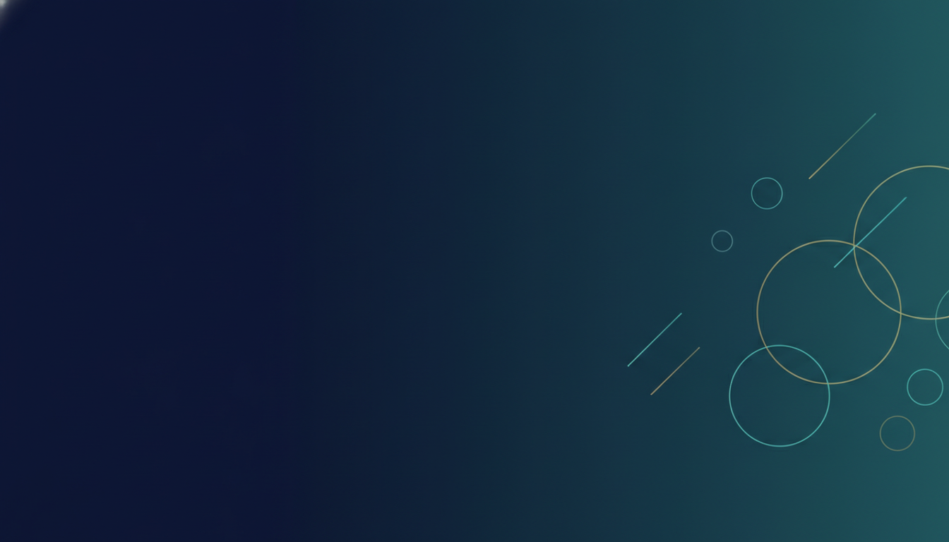
Gradient Mesh — Left Side Deliberately Empty
Made with GPT Image 2
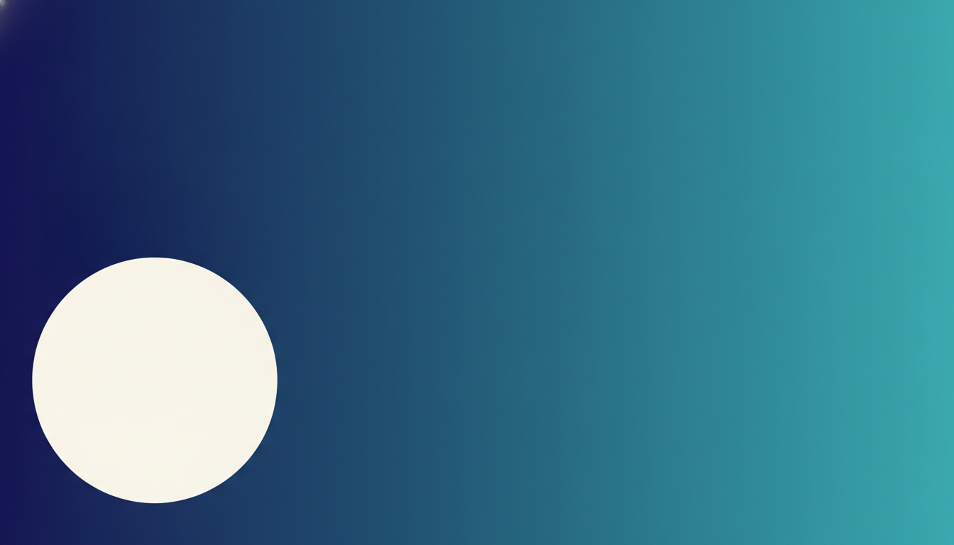
Where Your Profile Photo Actually Lands
Made with GPT Image 2
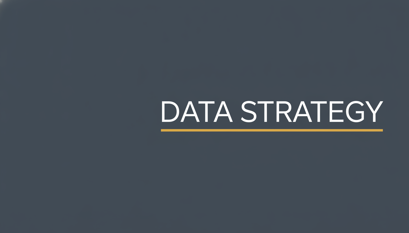
Bold Headline — and One Set Too Near the Edge
Made with GPT Image 2
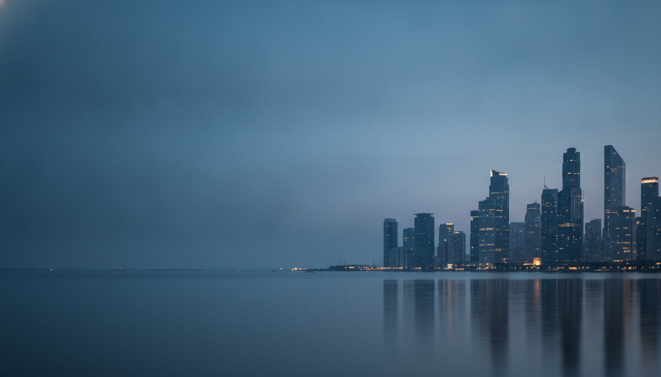
City Skyline at Blue Hour
Made with GPT Image 2
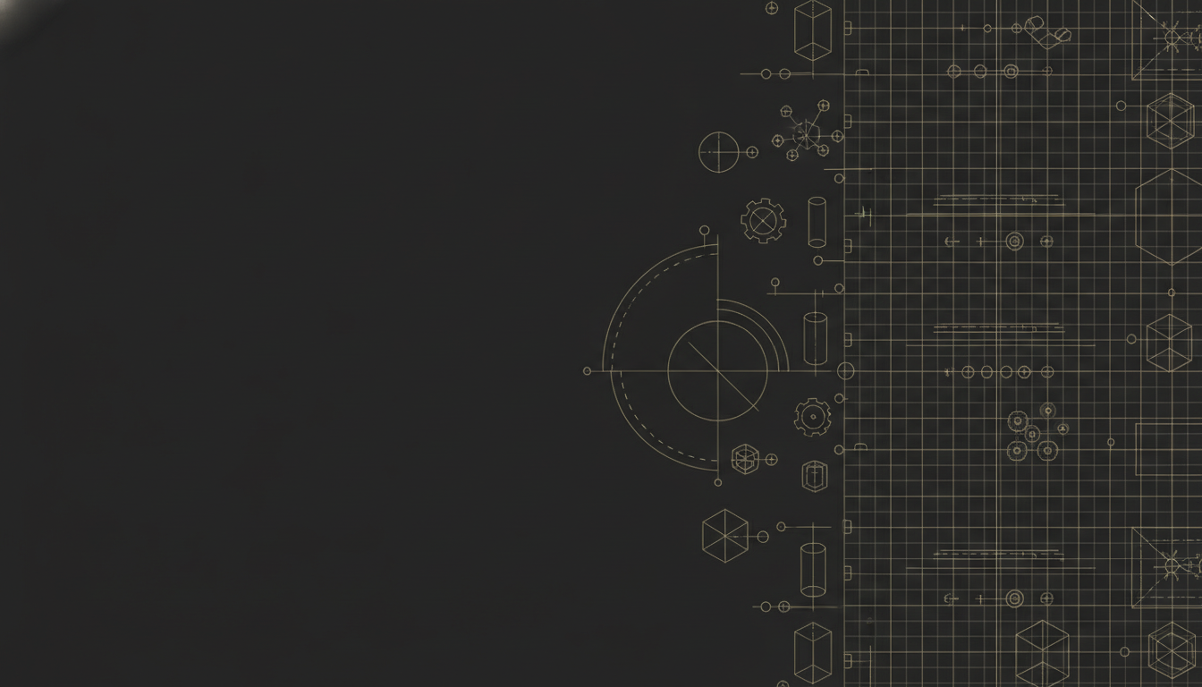
Technical Blueprint Lines
Made with GPT Image 2
Warm Minimal
Made with GPT Image 2
Three Things to Know Before You Upload
There is one crop step, on purpose. A LinkedIn banner is 1584 × 396, an unusually wide 4:1 strip, and the widest ratio this tool offers is 16:9. Taking a 16:9 image down to 4:1 keeps roughly the middle 45 percent of its height, which is why every preset places its subject in the central band — crop from the middle and you lose nothing that mattered. The left third is not yours. Your profile photo is a large circle anchored over the lower left of the banner, and your name and headline sit right beneath it. The diagram above is that overlap to scale. Keep the left plain and build into the right two thirds. And the phone crops the edges. The mobile app shows a narrower slice than the desktop site, so type set hard against the left or right edge can lose its outer letters — the DATA STRATEGY example above runs closer to the right edge than it should, and it is in the gallery precisely to show what that looks like.
How the AI LinkedIn Banner Generator Works
One style, one short line, one crop, then straight onto your profile
Pick a Style That Fits Your Field
Blueprint linework for engineering and architecture, city skyline for finance and sales, warm minimal for coaching and HR, gradient mesh for anything technical. The preset fixes the palette and the composition.
Add a Short Line, or Leave It Clean
Type two or three words and a colour if you want a headline on it — “the words GROWTH MARKETING, deep charcoal”. Keep it short and away from the edges. A clean background with no text works just as well.
Crop to 1584 x 396 and Upload
Take the middle band of the widescreen result down to the 4:1 strip, then upload it under Change photo on your profile and use LinkedIn’s reposition handle to check nothing sits behind your profile circle.
Why Use an AI LinkedIn Banner Maker
Because the default LinkedIn blue says nothing, and the free stock banner is on ten thousand other profiles
Composed Around the Profile Photo
Every preset pushes its subject into the right two thirds and leaves the left plain, because a large circular profile picture sits over the lower left of every LinkedIn banner and hides whatever is under it.
Widescreen Source, Built to Crop to 4:1
A LinkedIn banner is 1584 by 396. Presets keep the subject in the central horizontal band, so cropping the 16:9 output down to that strip takes nothing important with it.
Short Headlines Come Out Readable
Two or three words render cleanly here, which is the thing generic image tools still fumble. A misspelled banner is worse than no words at all, so the presets keep text short by design.
Six Styles That Actually Differ
Gradient mesh, bold headline, city skyline, blueprint linework, warm minimal and dark bokeh. Different palettes and different logic, not six variations on the same blue gradient.
Honest About the Crop and the Limits
The extra crop step, the mobile trim at the edges, the flat PNG with no layers, the tone drift between runs and the different company page size are all stated plainly, with the workaround.
Free, No Sign Up, No Watermark
Nothing stamped on the download and no account needed. Try three styles against your actual profile before deciding, not after.
Who Uses It
Anyone whose profile still has the stock blue rectangle across the top
Job Seekers
The main use. A recruiter opening your profile sees the banner before they read a word, and a banner that signals your field beats the default blue immediately. Two words and a clean background is enough.
Freelancers and Consultants
Your profile is the landing page. A banner in your own palette, stating what you actually do in three words, does more selling than another paragraph in the about section.
Sales Teams and Recruiters
A team on one preset with only the wording changed reads as a company rather than as ten unrelated people. Same style, same colours, different three words each.
Founders and Speakers
If people arrive at your profile after hearing you talk, the banner is the first thing that has to look deliberate. Generate a few, keep the one that still works with your headshot over it.
AI LinkedIn Banner Generator FAQ
Sizes, the profile photo overlap, headline text, uploading, company pages and what you cannot get back
Free AI LinkedIn Banner Generator — Built for a 4:1 Strip and a Circle in the Way
The banner is the largest single element on a LinkedIn profile and the one most people never touch. Left alone it is a flat blue rectangle that says nothing at all; the common upgrade is one of the handful of free stock banners, which says nothing either and says it in the company of several thousand identical profiles. The reason so few people fix it is not laziness, it is that the format is genuinely awkward to design for. A LinkedIn banner is 1584 by 396 pixels — a strip four times wider than it is tall, a shape almost nothing else on the internet uses. Upload a normal photograph and LinkedIn takes a thin horizontal slice out of the middle, which is why so many banners look like an accident. An AI LinkedIn banner generator changes the arithmetic: you describe the field and the mood, and fifteen seconds later there is widescreen art made for your palette that exists nowhere else and was composed for the strip in the first place.
What separates this LinkedIn banner maker from pointing a general image tool at the same prompt is that it is built around the two constraints the format actually imposes, and neither of them is obvious until your banner is already live and wrong. The first is the profile photo. Your picture is a large circle anchored over the lower left of the banner area, with your name, headline and location stacked directly beneath it — so the left third of the image is effectively unusable, and anything you centre carefully will end up half hidden behind your own face. The second image in the gallery above is that overlap drawn to scale, and it is the reason every preset here pushes its subject into the right two thirds and leaves the left as plain gradient. That emptiness is the design, not a shortcut. The second constraint is the crop. This tool is fixed to 16:9, the widest ratio it offers, so there is one honest extra step between generating and uploading: take the middle band down to 4:1. Going from 16:9 to 4:1 keeps roughly the central 45 percent of the height, which costs you nothing as long as the subject was placed centrally — which is exactly what the presets do.
The other half of the job is lettering, and it is where image models have historically been worst. Most AI banner art is wordless abstraction for a simple reason: the letters used to come back as gibberish, so people stopped asking for them. GPT Image 2 renders short phrases cleanly, and the DATA STRATEGY banner above landed correct on the first attempt, which is what lets a generated strip do the actual job of a LinkedIn banner — saying what you do before anyone reads your headline. Two or three words is the ceiling, and that is a design limit as much as a technical one on a 396 pixel strip. That same example carries the page’s other warning honestly: its type runs almost to the right edge, and because the LinkedIn mobile app shows a narrower slice than the desktop site, a headline set that close to the edge can lose its final letters on a phone. It is in the gallery on purpose. Three limits deserve stating as plainly as the strengths: the result is a flat image with no transparency, no layers and no editable text; the background tone drifts a shade between runs, so name your colour explicitly when matching a set; and a company page cover is a different shape again, closer to 1128 by 191, so generate and crop that one separately rather than reusing this crop.
The banner is only half of a profile header, so once it is up, the AI LinkedIn headshot generator handles the circle sitting on top of it, and the AI headshot generator covers the same job for profiles elsewhere. To take the widescreen output down to the 4:1 strip, use the AI image cropper, or the AI image extender if you would rather widen an image you already have than crop into it. For other platforms with their own awkward header shapes, the AI YouTube banner maker solves the equivalent problem there, and the AI social media content creator covers post and story formats. If you want your logo cleanly lifted off its background before placing it, the AI background remover does that, and the AI typography generator goes deeper on lettering. Scroll back up, pick a style, and give the top of your profile something to say.