
AI Paint Color Visualizer
See the Shade on Your Own Walls
Upload a photo of the room — or the front of the house — and watch the walls change color while the sofa, the floor and the light stay exactly where they were. Free, in about fifteen seconds, with a straight answer about what it cannot do.
Try the AI Paint Color Visualizer — Free
Upload one room photo, run two or three color families on it, and put the results next to each other
AI Paint Color Visualizer
Upload a photo of the room or the house front, then pick a color family below. Each preset repaints the walls and leaves the floor, furniture, woodwork and light alone. These are directions, not products — nothing here can render a named brand shade, so use it to shortlist and then buy a tester pot.
Upload your room or house photo, pick a color family, and run two or three so you can compare them side by side
Everything comes back at 4:3 landscape. To reshape a result for a board or a quote, use the AI image cropper. Want the furniture and layout changed too, not just the paint? That is the AI interior design tool indoors and the AI exterior design tool outside. Collecting shades, textures and finishes in one place first? Start with an AI mood board.
AI Paint Color Visualizer Examples
Six renders exactly as they came back — including the three that show you why this is a shortlisting tool
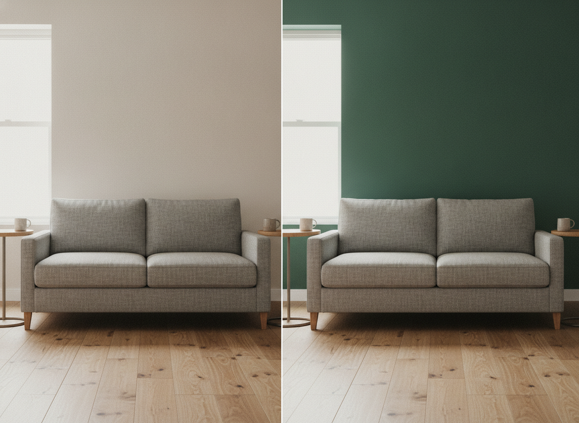
Same Room, Two Shades — and One Extra Table
The comparison this whole page is for, and the honest catch in it. The green side is not the white side with new paint: look at the far right edge and a second side table has appeared, and the sofa has grown wider. The wall color changed. So did other things.
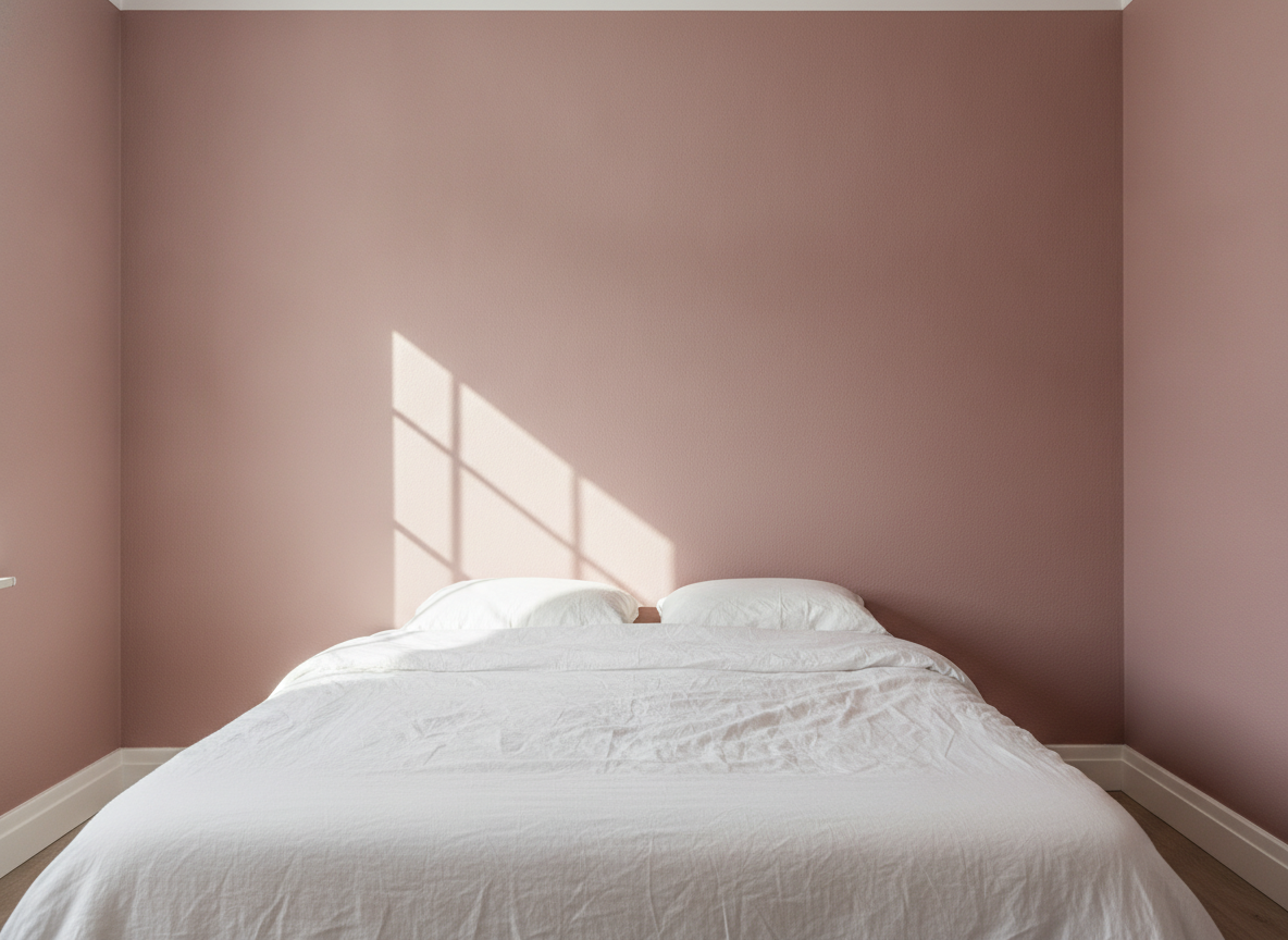
One Pink, Two Readings
A single dusty pink on every wall — and where the low window light rakes across it, that same paint reads almost peach, while the shaded corner reads mauve-brown. This is why a shade you loved in the shop can disappoint at home.
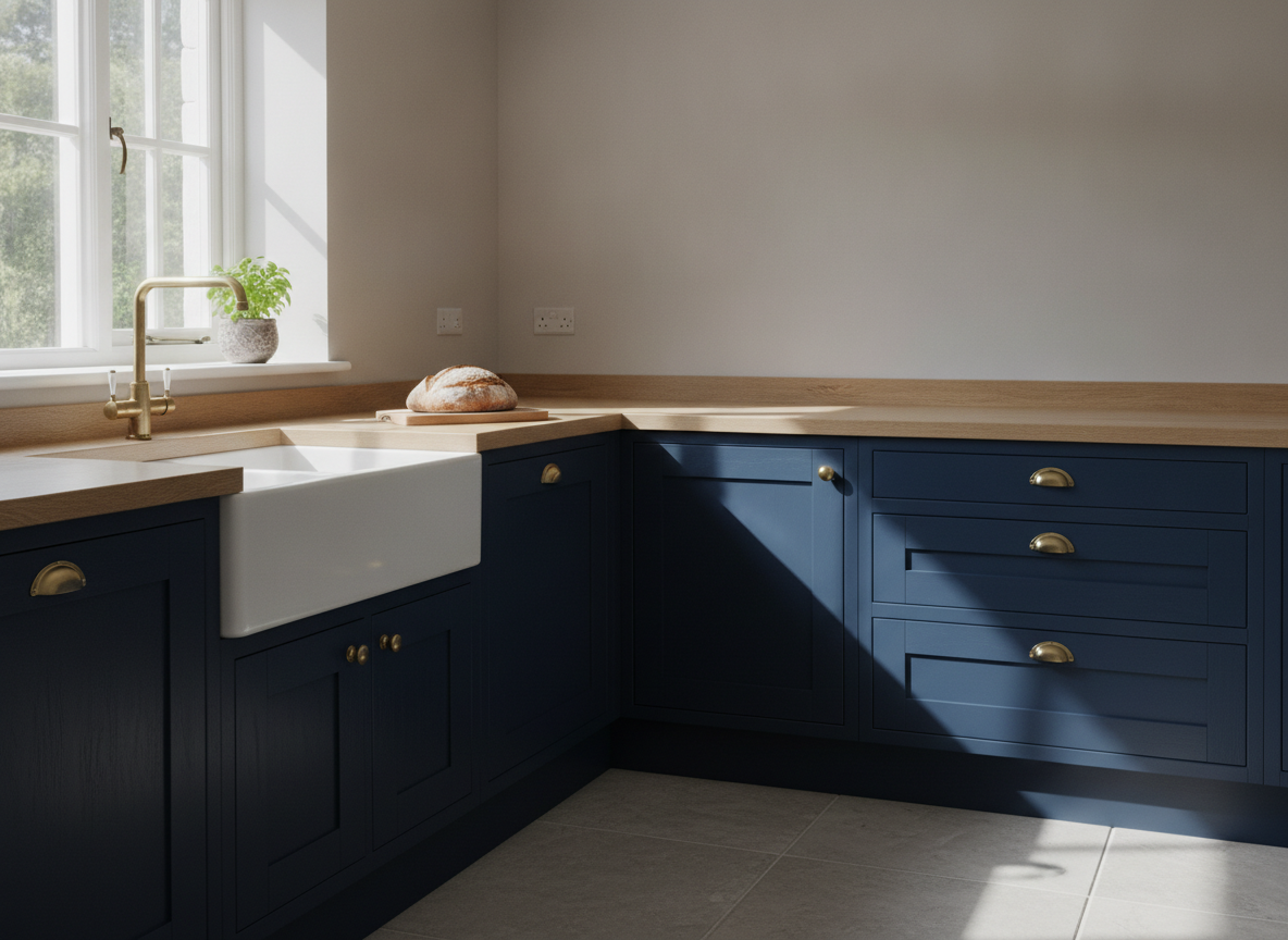
Navy in Sun, Navy in Shadow
Every cabinet here is the same navy. The run on the right sits in shade and reads as a brighter, more royal blue; the run at the front reads nearly black. Nothing is wrong with the render — that is how a dark saturated paint behaves.
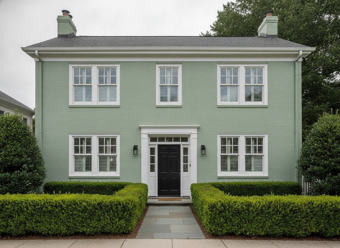
Exterior Body, Trim and Door
Flat overcast light is the fairest test for an exterior shade, which is why this one was shot that way. Worth noticing: the visualizer took the sage up onto the brick chimney stacks as well, which may or may not be what you were planning.
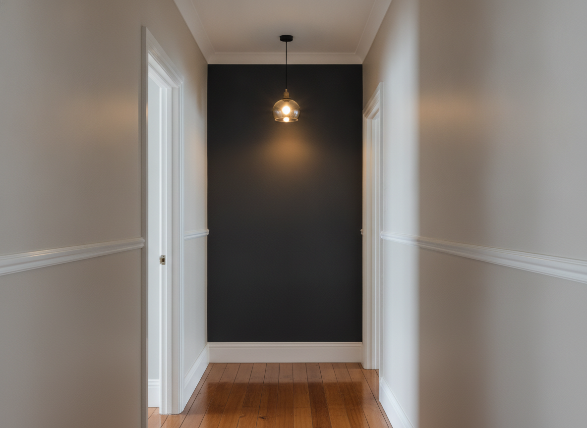
Dark Feature Wall Under Warm Light
The end wall is one charcoal from cornice to skirting. Under the pendant it goes warm and soft; a metre lower it is effectively black. Test any near-black shade at the darkest end of the room, not the brightest.
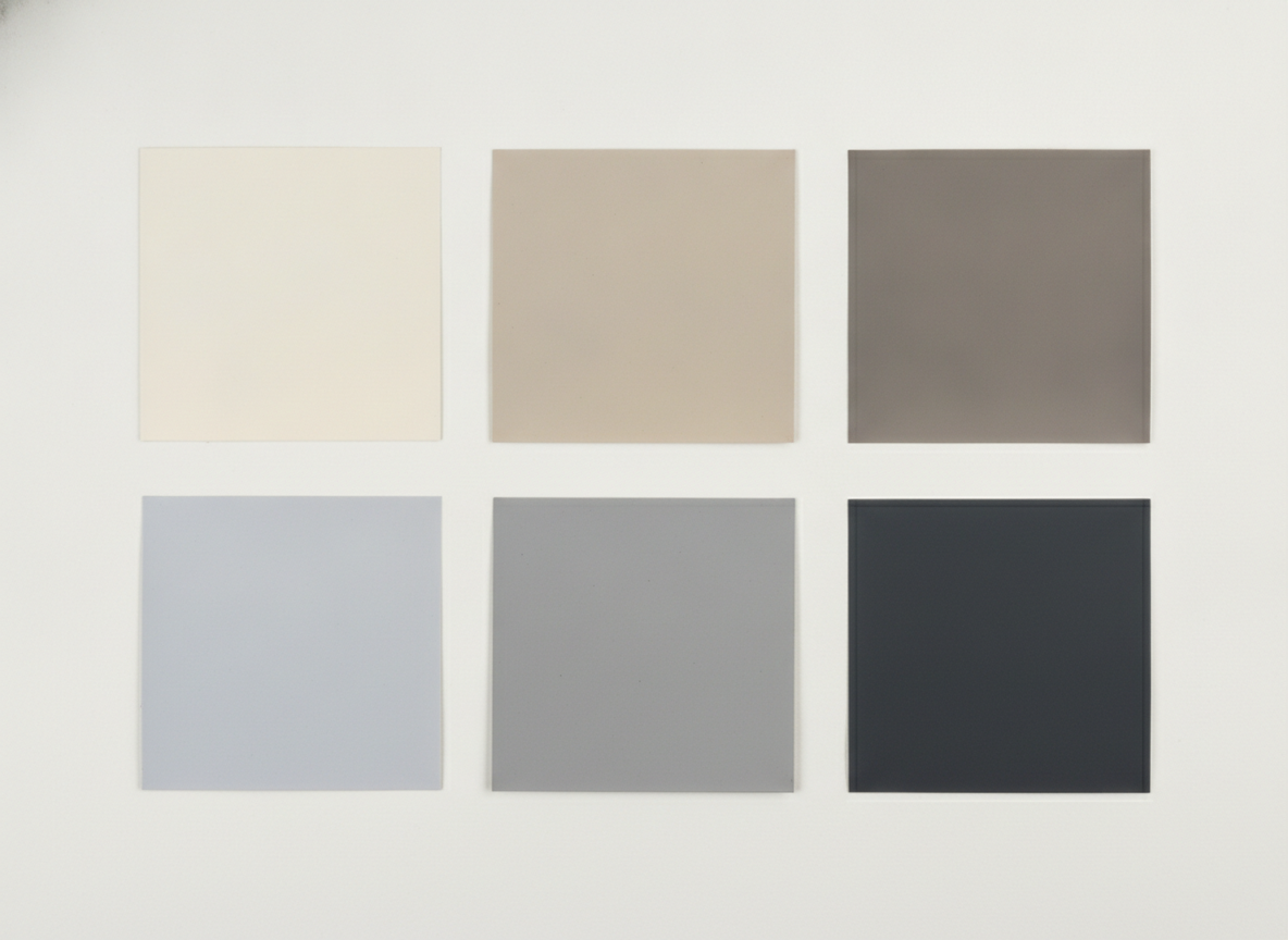
Six Neutrals Asked For — Six Came Back, Not These Six
The count is right, which is not a given. The palette is not: this was asked for a warm cream to cool greige run, and the bottom row drifted to a lilac-blue and a near-black. You choose a direction here, never an exact shade.
This Is Not a Color Matching Tool — Shortlist Here, Then Buy a Tester Pot
It cannot render a named brand shade. Not Hague Blue, not Agreeable Gray, not Egyptian Cotton. The presets are color families — warm neutral, muted color, deep and dramatic, blue-green, feature wall, exterior — and what you get back is a direction to take to a paint chart, not a product. The render re-lights the wall, so the hue moves. Two images in the gallery above prove it: one dusty pink reads peach in the window light and mauve in the shaded corner, and one navy reads near-black in the sun and royal blue in the shade. Your own monitor then shifts it again, and an uncalibrated phone, laptop and TV will each show you a different color from the same file. Other things in the room drift too. This re-renders your photo rather than masking the walls, so furniture can move, grow or multiply — the first comparison above gained an entire side table on the green side. Treat every result as a picture of a room like yours, not of your room. So finish the job on the wall. Shortlist two shades here, buy the tester pots, paint an A4 patch on the actual wall, and look at it in the morning and again under the lamps at night. That last step costs about the price of a coffee and is the only one that is actually accurate.
How the AI Paint Color Visualizer Works
Photograph the wall, pick a direction, then prove it with a tester pot
Photograph the Room You Are Painting
Stand in the doorway, hold the phone level and get as much wall in frame as you can. Shoot it in the light you actually live in — the evening lamp light matters as much as the midday sun.
Pick a Color Family, Not a Shade
Warm neutral, muted color, deep and dramatic, blue and green, feature wall, or exterior. Run two or three on the same photo so you are comparing like with like rather than remembering.
Shortlist, Then Test a Real Patch
Take the direction you liked to a paint chart, buy a tester pot, and paint an A4 patch on the wall itself. Look at it in the morning and at night. That is the decision; this was the shortlist.
Paint Has No Color of Its Own
This is the idea the whole page rests on, and it is worth thirty seconds. A tin of paint has a reflectance, not a color — what you see is the light in your room bouncing off it. North-facing light drags everything cool and grey. Four o’clock in a south-facing room drags it warm and yellow. A 2700K bulb turns a grey brown; a 4000K bulb turns the same grey blue. That is why the shade you fell for under the shop’s fluorescent tubes can look like a completely different paint on your landing, and why an AI paint color visualizer that keeps your own light in the frame is more useful than a flat swatch on a screen. It is also why the last step is never optional. The visualizer narrows six directions down to two. A tester patch on the actual wall, looked at in daylight and again at night, picks the winner.
Why Use a Wall Color Visualizer
Because a two-inch card in a shop tells you almost nothing about a wall in your house
One Variable, Not a Redesign
Every preset repaints the walls and leaves the floor, furniture, woodwork and camera angle alone. You are comparing paint, not comparing rooms — which is the only way a comparison tells you anything.
Your Own Light, Not a Showroom
The render keeps the light that was in your photo, so a north-facing room stays cool and a warm bulb stays warm. That is the whole reason a shade you loved on a card can disappoint on the wall.
Interiors and Exteriors
The same single-variable logic applied to a house front: body color changes, trim and door hold their contrast. Shoot the elevation on an overcast day for the fairest read.
Feature Wall Preset
Repaint only the wall facing the camera and hold the others neutral. The quickest way to find out whether a dark shade will make a small room cosy or make it a cave.
An Honest Limit, Stated Up Front
It cannot match a named brand shade, and the gallery on this page shows you three separate reasons why rather than burying it in a footer. Shortlist here, then buy a tester pot.
Free, No Sign Up, No Watermark
About fifteen seconds per render and nothing stamped on the download. Run three color families on the same room photo before you decide which two are worth a tester pot.
Who Uses It
Anyone about to spend a weekend and forty pounds finding out they picked the wrong grey
Homeowners Redecorating
Four cards from the same chart, all of which look identical in the shop and none of which look the same on the landing. Run them on the actual room and two will drop out immediately.
Renters and Housemates
A picture settles an argument faster than a description does, and it is a much easier thing to send a landlord than the words “a sort of greeny grey”.
Painters and Decorators
Show a client the dark hallway before you quote for it, rather than after they see it dry. Two renders in the survey visit prevent one repaint at your own cost.
Design Students and Stylists
Fast scheme iteration on a real space for a portfolio or a client presentation, with the furniture and light held constant so the color is genuinely the thing being compared.
AI Paint Color Visualizer FAQ
Brand shades, changing light, what drifts on a re-render, exteriors, sizes and pricing
Free AI Paint Color Visualizer — One Variable, Your Own Walls
Choosing paint is hard for a reason that has nothing to do with taste. A color card is two inches wide, held at arm’s length, under lighting designed to sell it, next to forty other cards that are all bouncing color onto each other. The wall you are actually painting is nine square metres, lit from one side by a window that faces north, and lit at night by a warm bulb that will drag every neutral in the room towards brown. Nothing about the first situation predicts the second. That gap is what an AI paint color visualizer closes: you photograph the wall you are painting, in the light you actually live in, and see the shade on that surface instead of on a card. Every preset on this page has the same brief — repaint the walls and change nothing else — because a comparison is only worth anything if one thing moved.
It is deliberately a narrow tool, and knowing where its edges are tells you which page you actually want. The AI interior design tool restyles the whole room — furniture, layout, flooring, era — and the AI exterior design tool does the same to a house front; both answer “what could this be?” where a wall color visualizer answers “what would this be in green?”. An AI mood board is where a scheme starts, before you are down to two shades. The AI garden design generator handles everything outside the walls, and AI wall art is what goes on them once the paint is dry. If you are photographing a room to sell rather than to decorate, the real estate photo editor is the one you want.
Now the part that makes this page worth trusting, and the reason the gallery above is annotated rather than just pretty. This is not a color matching tool. It cannot give you Farrow & Ball Hague Blue or Sherwin-Williams Agreeable Gray, because GPT Image 2 re-renders and re-lights the wall rather than filling it with a hex value — and because whatever hue does come back then shifts again on whichever uncalibrated screen you are reading this on. The gallery demonstrates that rather than asserting it. A single dusty pink reads almost peach where window light rakes across it and mauve-brown in the shaded corner of the same photograph. A single navy reads near-black on the sunlit cabinets and bright royal blue on the run standing in shade. And the swatch grid, asked for a warm cream to cool greige run, returned six squares that drift into lilac-blue and near-black instead. Those are not bugs to apologise for; they are the same thing that happens to real paint in a real room, plus a reminder that the exact shade is never yours to specify here.
The other honest limit is what happens to everything that is not a wall. Because the model paints a new photograph rather than masking off the walls in yours, the rest of the room drifts a little. The first comparison in the gallery is one living room rendered twice, and the green version has gained an entire second side table with a mug on it at the right-hand edge, along with a slightly wider sofa. On the exterior, the sage green ran up onto the brick chimney stacks — a decision a decorator would have asked you about first. So read every result as a picture of a room very like yours, painted in the direction you asked about, and no more precise than that. Used that way it is genuinely valuable: six directions down to two in about thirty seconds, free, with no sign up and no watermark, at 4:3 landscape for both rooms and elevations — the AI image cropper reshapes it if you need another format. Then do the one thing no screen can do for you: buy two tester pots, paint an A4 patch on the wall itself, and look at it in the morning and again at night. Scroll back up, upload the room, and start narrowing.